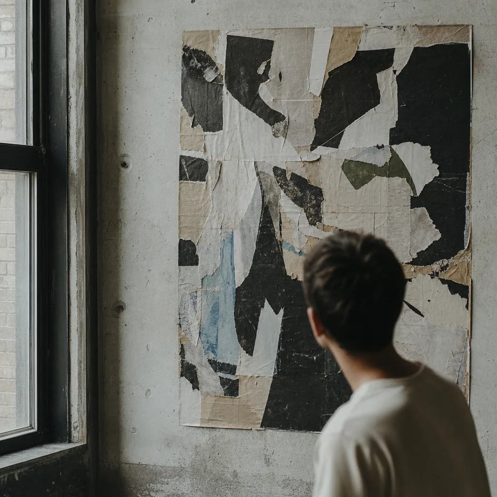
Clashing type, garish color, deliberate mess. Why a generation of designers is embracing the things good taste told them to avoid.
For years the reigning style of graphic design was clean: generous white space, one tasteful sans-serif, muted color, everything centered and calm. It was competent and it was everywhere, and eventually it became invisible in the way that everything universal becomes invisible. Then, quietly, the ugly poster came back.
By ugly, its makers mean something specific: type that clashes on purpose, color that refuses to soothe, layouts that feel a little broken. It is a reaction against a decade of sameness, a way of being seen in a feed engineered to smooth every rough edge away. If refinement no longer stops the scroll, perhaps friction will.
But the interesting thing is that the good examples are not actually careless. Making something look chaotic while remaining legible, energetic, and balanced is far harder than making it look neat. The mess is composed. The clash is tuned. What appears to be a rejection of craft is often craft working overtime to hide itself.
There is a lineage here, too. Every generation that inherits a polished orthodoxy eventually rebels against it, from punk flyers to the grunge typography of the nineties. Ugliness, deployed with intent, is one of design history most reliable engines of renewal. Today it just happens to be fighting for attention against an algorithm.
Replace this with your own take: the loud poster you cannot stop looking at, the line between expressive and simply bad, and whether the messy turn is a real movement or a passing mood. — Written by the editors.